Services
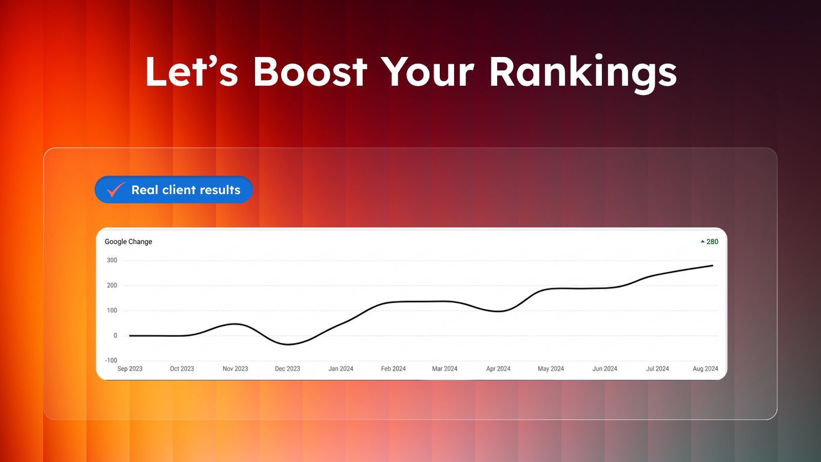
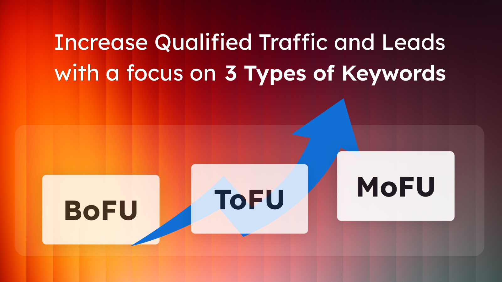
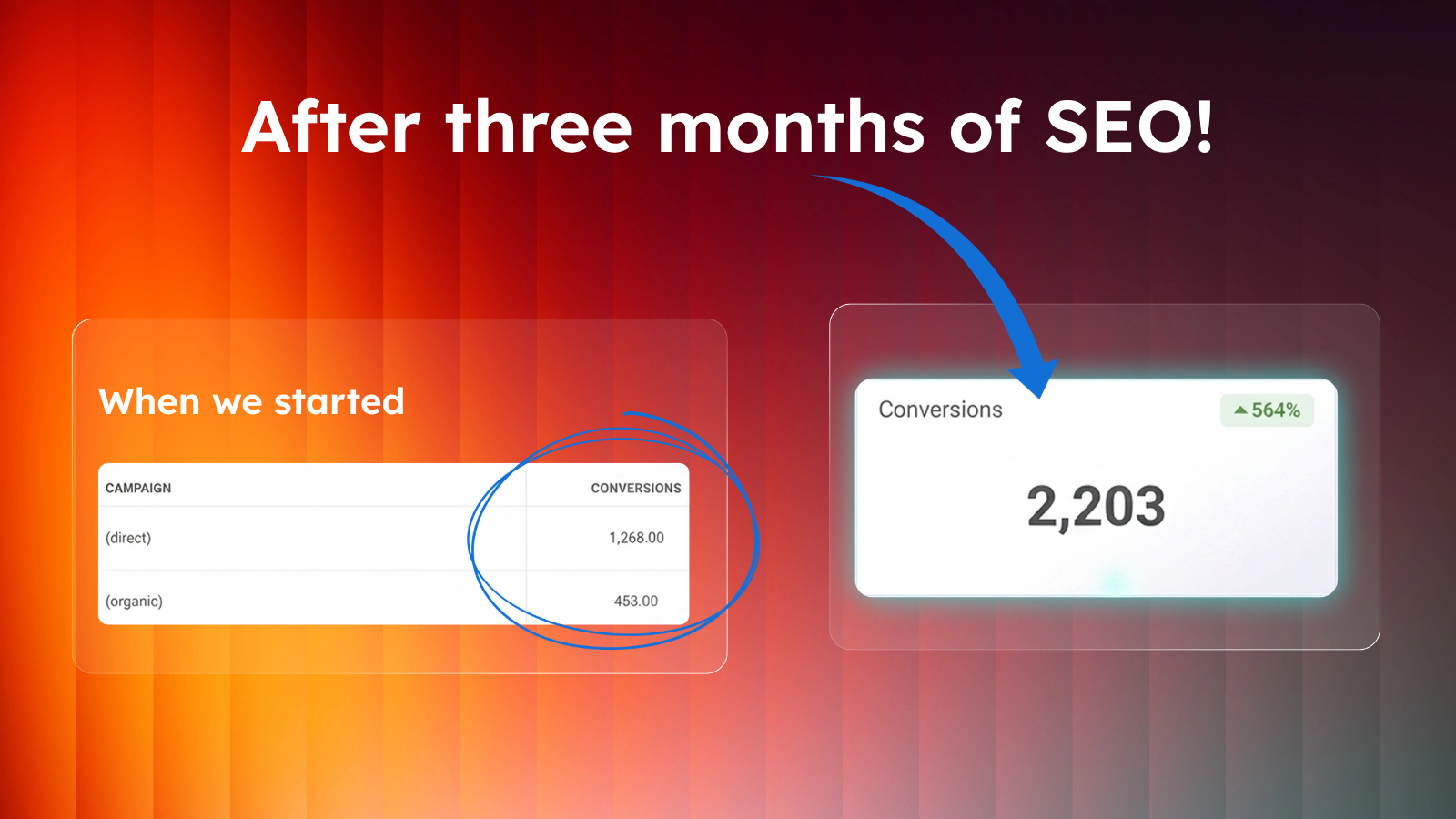
SEO Strategy
Cutting-edge SEO that drives traffic, leads, and long-term growth
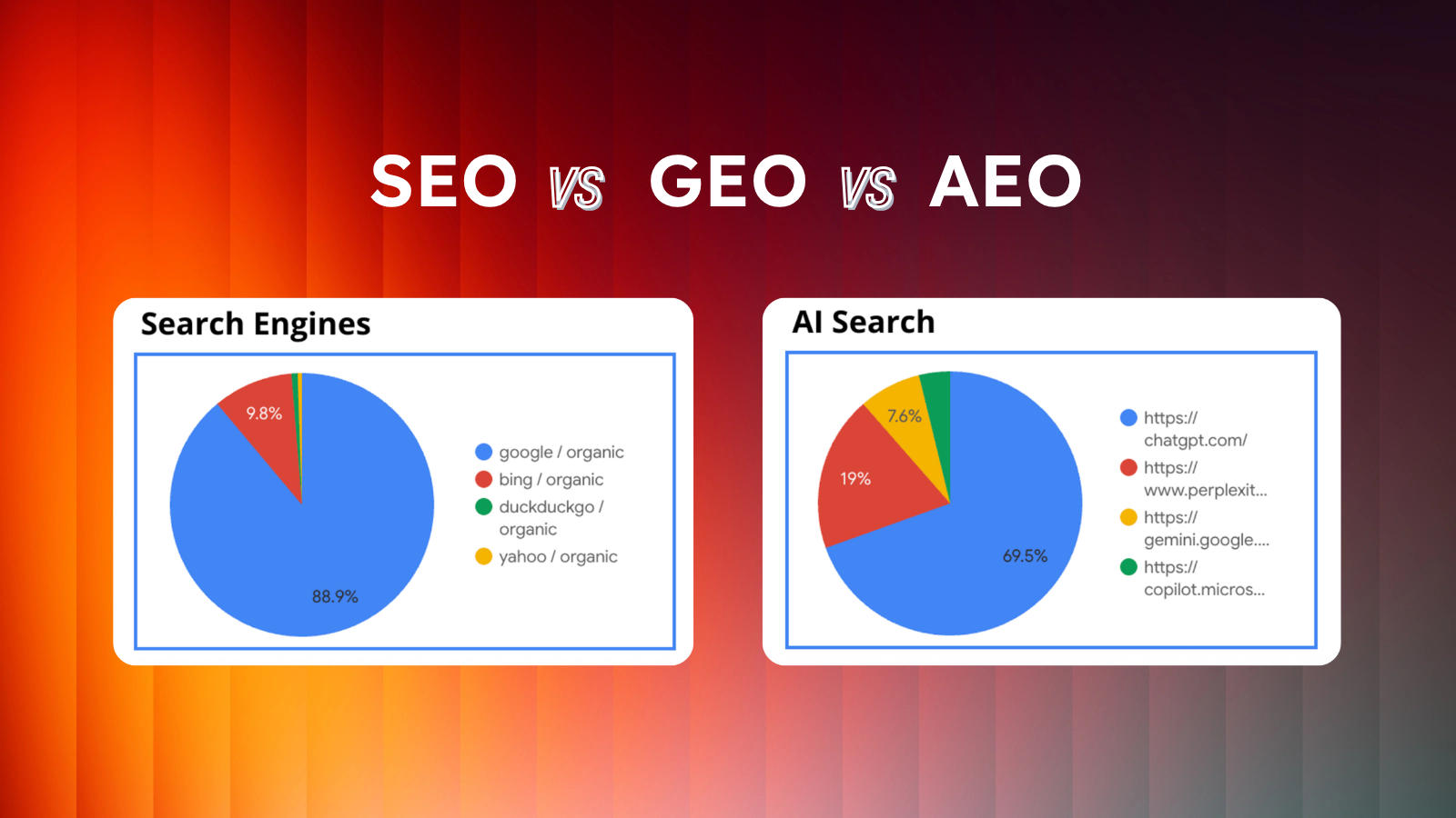
GEO
Rank higher in zero-click and AI searches with content designed for LLMs
Content Strategy
Content strategy built around your buyers, your products, and your goals.
Technical SEO & Migrations
Seamless site launches and technical SEO that boost speed, rankings, and traffic
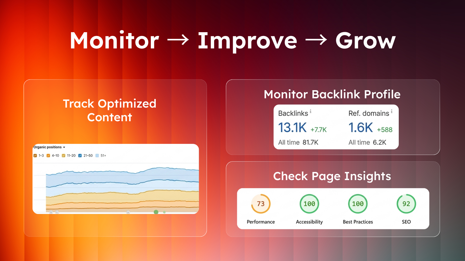
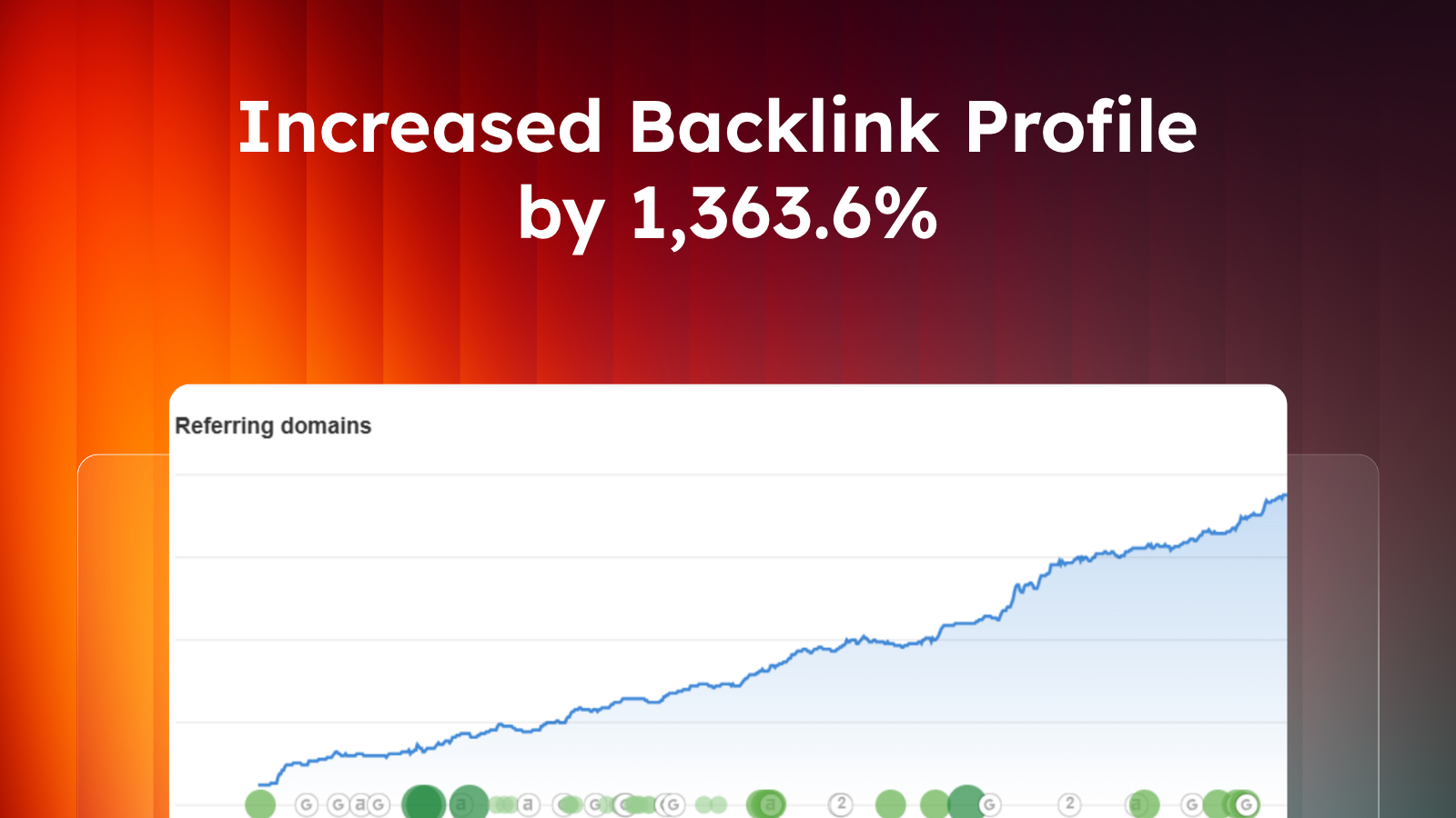
Link Building
High-quality, relevant backlinks that lift your bottom-of-funnel keywords.
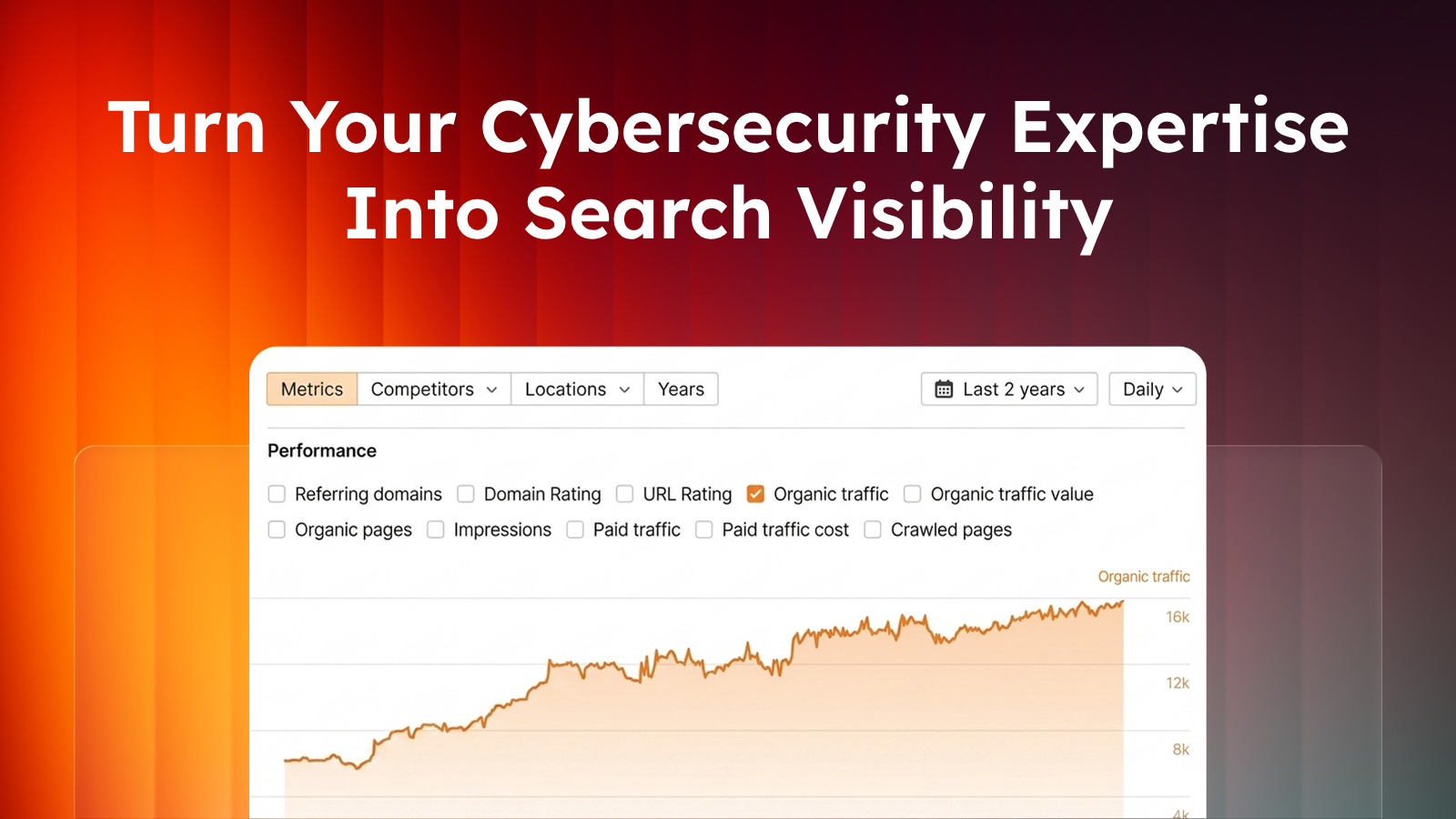
Industries
Cybersecurity
Other Industries
Our Work
Blog
About
Let's Talk
Our latest articles
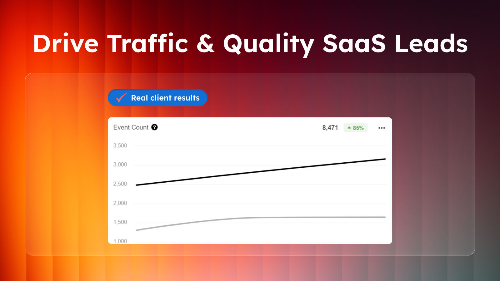
Cybersecurity Marketing Strategy: 5 Proven Ways to Grow Your Pipeline
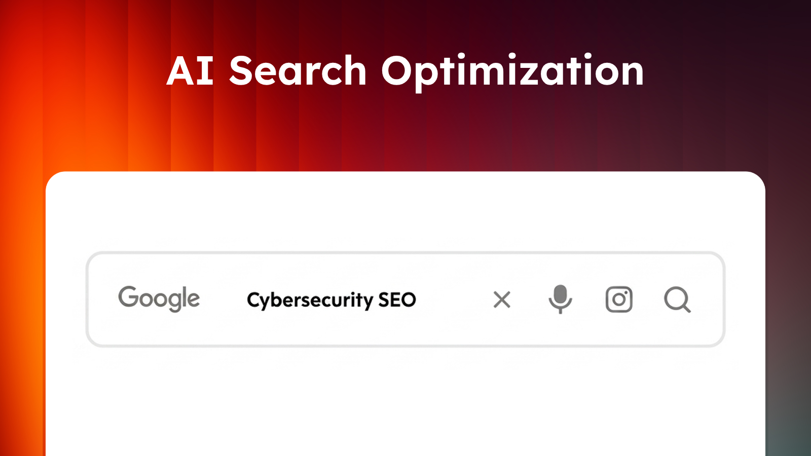
Cybersecurity SEO and GEO: How to Increase Visibility in AI Search
SEO ROI: How to Measure the Value of Organic Search
Cybersecurity Content Marketing: A Strategy Guide for AI-Era Search
Cybersecurity SEO Guide : Improve Rankings and Attract More Leads
SEO vs GEO vs AEO: What's the Difference (and Which Strategy Do You Actually Need)?
Cybersecurity Lead Generation: Strategies for Success
6 Common Cybersecurity SEO Issues and How to Fix Them
B2B SEO Strategy Guide: Your Roadmap to Better Rankings
The Complete Guide to Enterprise SaaS SEO
Amplifyed Named to 2025 Inc. 5000 List of Fastest-Growing Companies
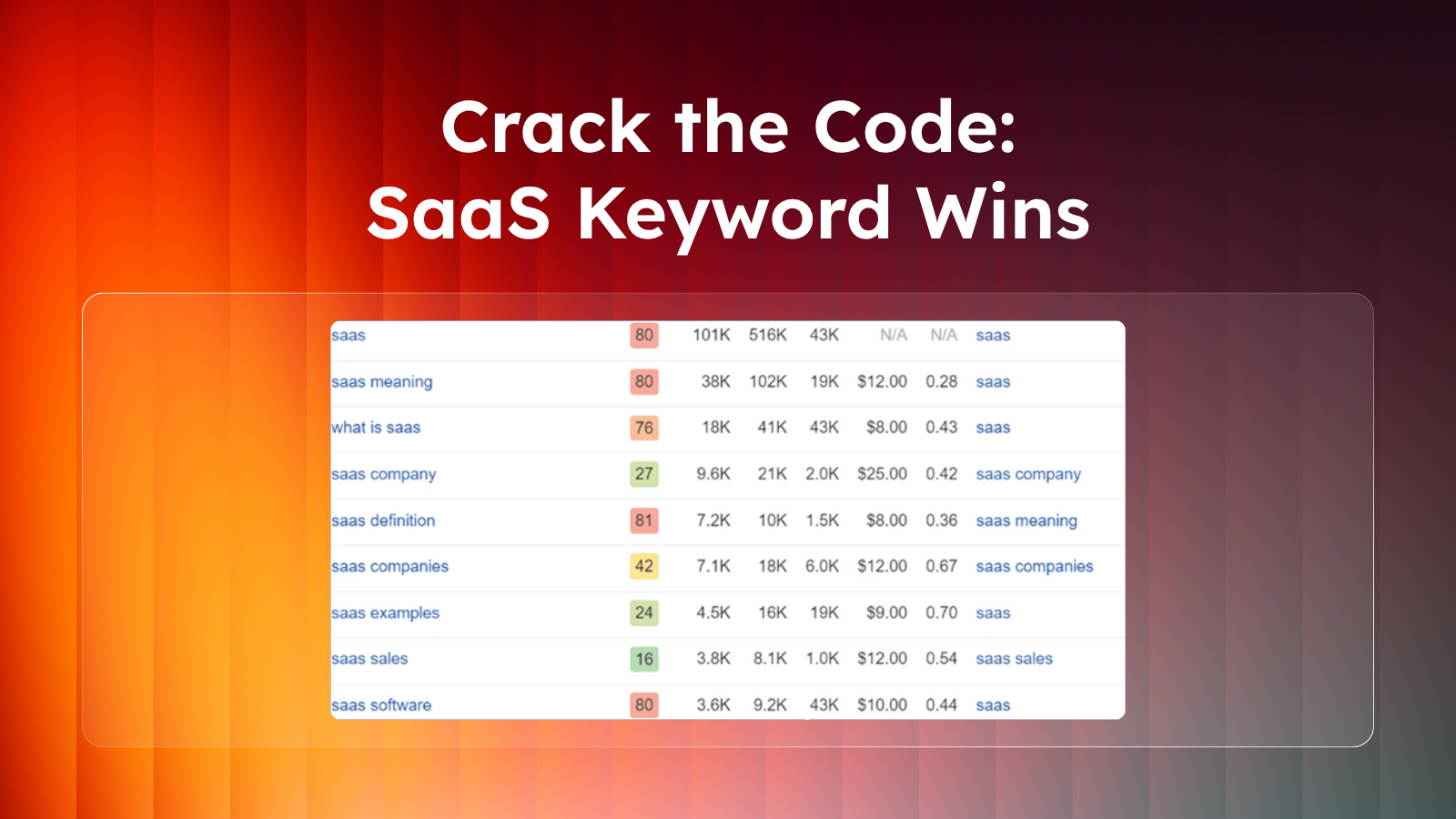
Your Complete Guide to SaaS Keyword Research
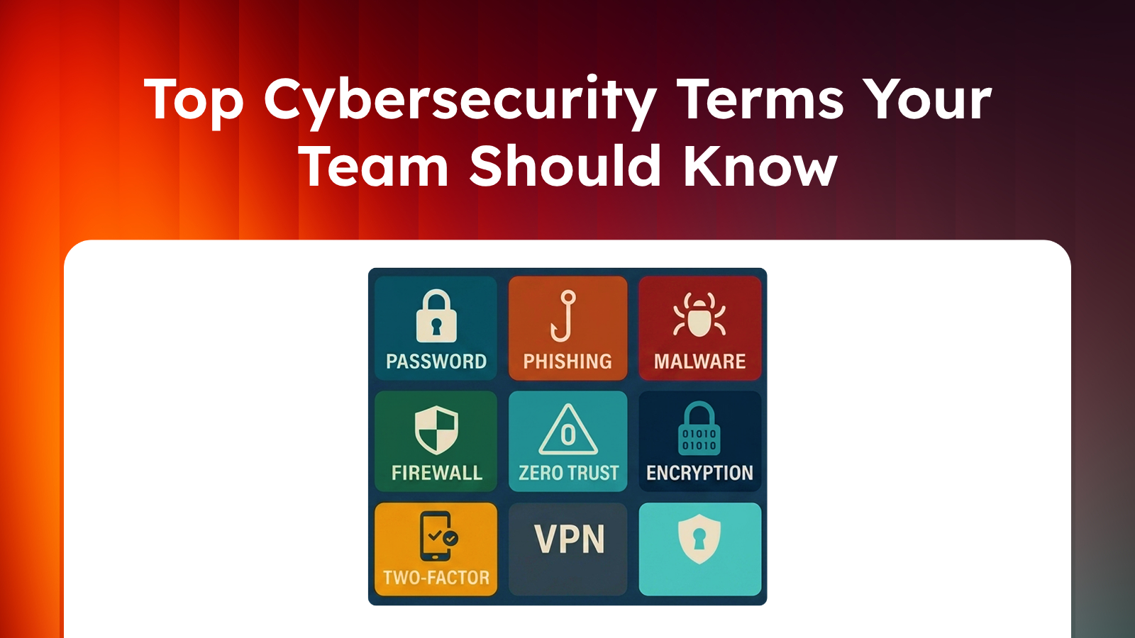
50+ Essential Cybersecurity Terms
Cybersecurity SEO Case Study: How We Drove a 64% Organic Traffic Increase in 5 Months
Top 9 Best SEO Agencies for Cybersecurity Companies
How We Increased A Cybersecurity Brand’s Organic Traffic By 64% in Five Months
How We Drove 1,100% Organic Traffic Growth for a Tech Startup
B2B SaaS Content Marketing: How to Drive Growth with SEO-Focused Strategies
AI Search Optimization: Adapting Cybersecurity SEO Content to AI Search Algorithms
How Cybersecurity Protects Your Website and Boosts SEO Rankings
Agency vs In House SEO Solutions: Pros and Cons Revealed
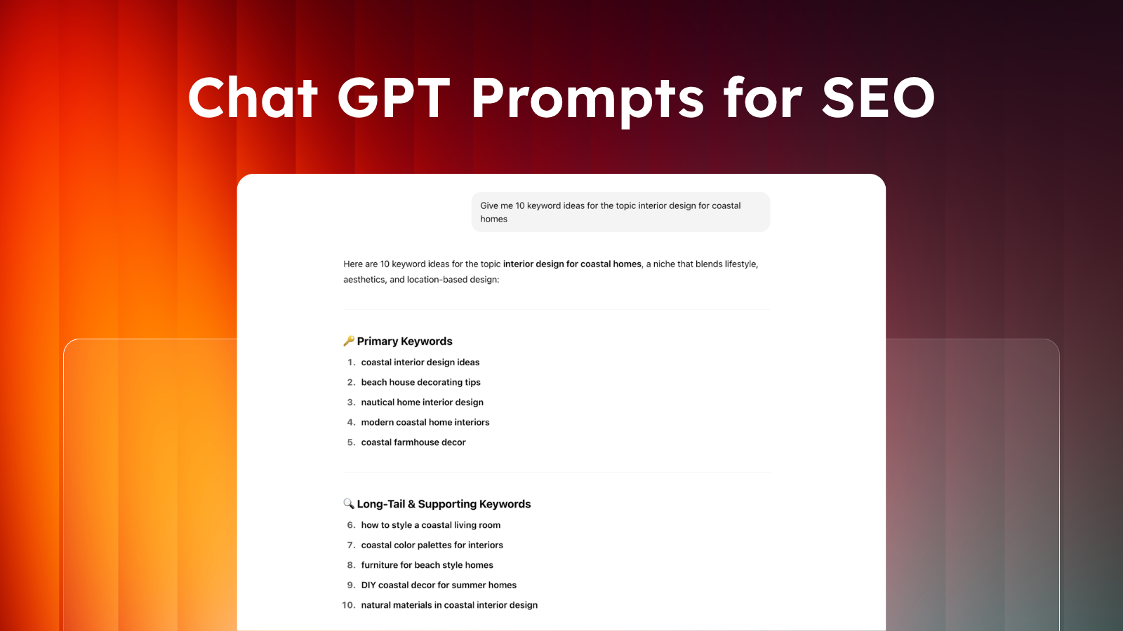
BEST SEO Prompts for ChatGPT: Creating Optimized Content that Ranks
Secrets of the Pros: Expert Tested SaaS SEO Tools
SaaS Link Building: Expert Tips for Quality Links
Partnering Up For Success: How To Find The Right B2B SEO Agency To Boost Your Rankings
How to Find the Best SaaS SEO Consultant
© 2026 Amplifyed. All rights reserved.
Privacy Policy
Cookie Policy


.png)
.png)

.png)


.png)